Difference between revisions of "CNMCyber.com design"
(→Landing) |
|||
| (90 intermediate revisions by the same user not shown) | |||
| Line 1: | Line 1: | ||
| − | + | [[CNMCyber.com design]] is the design of the primary [[landing page]] (hereinafter, the ''Page'') of [[CNMCyber.com]]. | |
| + | |||
| + | ==Trivia== | ||
| + | ===Action areas=== | ||
| + | :There are three groups of action areas on the ''Page'': | ||
| + | :#[[#Landing|Landing screen]], | ||
| + | :#[[#Stories|Stories screen]], | ||
| + | :#[[#Leads|Leads screen]], | ||
| + | :The sizes of these areas shall be the same. | ||
| + | |||
| + | ===Colors=== | ||
| + | :They shall be stylish, but simple. No more than 3 colors including the logo, but excluding color pictures. Here is the previous design that the same customer purchased before -- https://worldopp.com/ | ||
| + | |||
| + | ===Fonts=== | ||
| + | :They shall be stylish, but simple. No more than 2 fonts including the logo. | ||
| + | |||
| + | ===Photos=== | ||
| + | :Stock images can be used as placeholders; the permanent images shall be taken from https://www.meetup.com/TechDC/photos/ | ||
| + | |||
| + | ===Wiferfames=== | ||
| + | :{|class="wikitable" width=100% style="text-align:center;" | ||
| + | | | ||
| + | !Mobile!!Tablet!!Desktop | ||
| + | |- | ||
| + | !Draft | ||
| + | |colspan="2"|To be decided||[[File:Cnm-cyber-com.png|thumb]]The blocks indicate positioning, but various elements and colors are yet to be designed. | ||
| + | |} | ||
| + | |||
| + | ==Sections (screens)== | ||
===Landing=== | ===Landing=== | ||
:The landing screen features: | :The landing screen features: | ||
| − | :{|class="wikitable" | + | :{|class="wikitable" width=100% style="text-align:center;" |
| − | !Desktop!!Mobile | + | | |
| + | !Mobile!!Tablet!!Desktop | ||
| + | |- | ||
| + | !Fireframe draft | ||
| + | |[[File:Focnm-org.png|thumb|Draft for inspiration]]||rowspan="3"|To be decided||[[File:Landing-screen.png|thumb]] | ||
| + | |- | ||
| + | !Header | ||
| + | |Logo, main menu | ||
| + | |Logo, search bar, main menu | ||
| + | |- | ||
| + | !Action area | ||
| + | |No background; (a) invitation "Let's", (b) 4 action areas, (c) upper half of the next section title | ||
| + | |Video background; (a) invitation "Welcome to Cyber. Let's", (b) 2 "more" buttons, (c) 4 action areas, (d) upper half of the border-less banner "Or allow our fellow to make some magic for you" | ||
| + | |} | ||
| + | |||
| + | ===Banner=== | ||
| + | :The no-charge banner features: | ||
| + | :{|class="wikitable" width=100% style="text-align:center;" | ||
| + | | | ||
| + | !Mobile!!Tablet!!Desktop | ||
| + | |- | ||
| + | !Fireframe draft | ||
| + | |colspan="2"|To be decided||[[File:Banner-screen.png|thumb]] | ||
| + | |- | ||
| + | !Body | ||
| + | |colspan="2"|This section may or may not be included depending on the designer's preference||Text on a picture; the picture is the background | ||
| + | |} | ||
| + | |||
| + | ===Stories=== | ||
| + | :The stories' screen features: | ||
| + | :{|class="wikitable" width=100% style="text-align:center;" | ||
| + | | | ||
| + | !Mobile!!Tablet!!Desktop | ||
| + | |- | ||
| + | !Fireframe draft | ||
| + | |[[File:Focnm-slider.png|thumb|Draft for inspiration]]||To be decided||[[File:Stories-screen.png|thumb]] | ||
| + | |- | ||
| + | !Body | ||
| + | |colspan="3"|To be decided; this could be a manual carousel or something else | ||
| + | |} | ||
| + | *https://premiumaddons.com/carousel-widget-for-elementor-page-builder/ | ||
| + | |||
| + | ===Tiles=== | ||
| + | :The tiles' screen features: | ||
| + | :{|class="wikitable" width=100% style="text-align:center;" | ||
| + | | | ||
| + | !Mobile!!Tablet!!Desktop | ||
|- | |- | ||
| − | | | + | !Fireframe draft |
| + | |colspan="2"|To be decided||[[File:Tiles-screen.png|thumb]] | ||
|- | |- | ||
| − | : | + | !Body |
| − | + | |colspan="3"|The customer loves tiles similar to Windows 8 start menu. If you forgot how they looked like, you are welcome to get to around 1:00/12:43 of this video -- https://www.youtube.com/watch?v=_E1UxI5I_jo -- the tiles could flip and slide both vertically and horizontally. | |
|} | |} | ||
| − | === | + | ===Choices=== |
| − | : | + | :The choices' screen features: |
| + | :{|class="wikitable" width=100% style="text-align:center;" | ||
| + | | | ||
| + | !Mobile!!Tablet!!Desktop | ||
| + | |- | ||
| + | !Fireframe draft | ||
| + | |colspan="2"|To be decided||[[File:Choice-screen.png|thumb]] | ||
| + | |- | ||
| + | !Body | ||
| + | |colspan="3"|This section is the most questionable. There can be 8 buttons on the desktop version. However, the most logical thing would be to have four action areas and deeper choices on another page. | ||
| + | |} | ||
| + | |||
| + | ===Leads=== | ||
| + | :The leads' screen features: | ||
| + | :{|class="wikitable" width=100% style="text-align:center;" | ||
| + | | | ||
| + | !Mobile!!Tablet!!Desktop | ||
| + | |- | ||
| + | !Fireframe draft | ||
| + | |colspan="2"|To be decided||[[File:Leads-screen.png|thumb]] | ||
| + | |- | ||
| + | !Body | ||
| + | |colspan="3"|Whatever design would be, its action areas shall be similar to the ones on the [[#Landing|landing screen]]. | ||
| + | |} | ||
| + | |||
| + | ===Bottom=== | ||
| + | :The bottom screen features: | ||
| + | :{|class="wikitable" width=100% style="text-align:center;" | ||
| + | | | ||
| + | !Mobile!!Tablet!!Desktop | ||
| + | |- | ||
| + | !Fireframe draft | ||
| + | |[[File:Focnm-org-footer-start.png|thumb|Draft for inspiration]]||To be decided||[[File:Bottom-screen.png|thumb]] | ||
| + | |- | ||
| + | !Body | ||
| + | |colspan="3"|The standard footer is fine; the "stay in touch" action area shall include social media icons. | ||
| + | |} | ||
| − | === | + | ==Design drafts== |
| − | |||
| − | == | + | ===Early drafts=== |
| + | <gallery> | ||
| + | File:Wireframe-mobile.PNG|Early wireframe for the mobile landing | ||
| + | File:Cnmcyber-com-desktop.jpg|Early desktop design draft | ||
| + | </gallery> | ||
| − | === | + | ===Latest drafts=== |
| − | : | + | <gallery> |
| + | File:Cnmc-mobile.jpg|Latest mobile design draft | ||
| + | File:Cnmc-desktop.jpg|Latest desktop design draft | ||
| + | </gallery> | ||
Latest revision as of 01:13, 18 November 2023
CNMCyber.com design is the design of the primary landing page (hereinafter, the Page) of CNMCyber.com.
Contents
Trivia
Action areas
- There are three groups of action areas on the Page:
- The sizes of these areas shall be the same.
Colors
- They shall be stylish, but simple. No more than 3 colors including the logo, but excluding color pictures. Here is the previous design that the same customer purchased before -- https://worldopp.com/
Fonts
- They shall be stylish, but simple. No more than 2 fonts including the logo.
Photos
- Stock images can be used as placeholders; the permanent images shall be taken from https://www.meetup.com/TechDC/photos/
Wiferfames
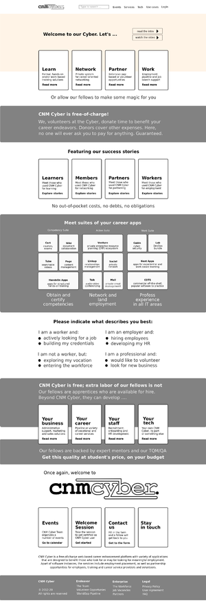
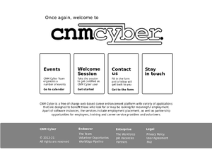
Mobile Tablet Desktop Draft To be decided The blocks indicate positioning, but various elements and colors are yet to be designed.
Sections (screens)
Landing
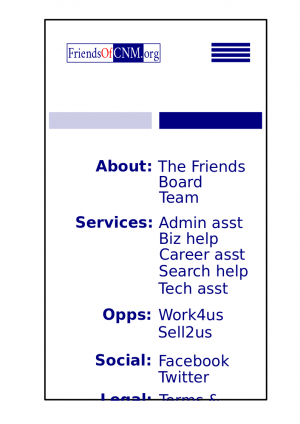
- The landing screen features:
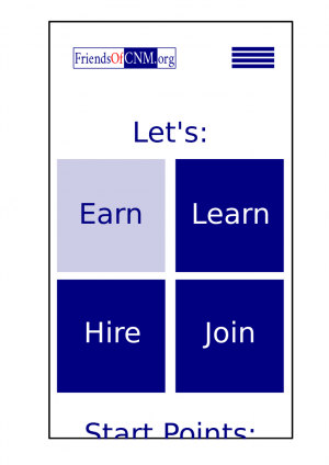
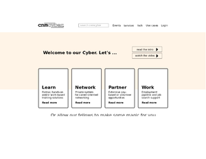
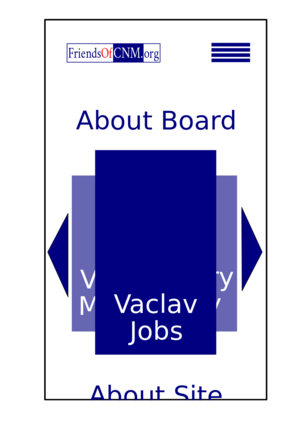
Mobile Tablet Desktop Fireframe draft To be decided Header Logo, main menu Logo, search bar, main menu Action area No background; (a) invitation "Let's", (b) 4 action areas, (c) upper half of the next section title Video background; (a) invitation "Welcome to Cyber. Let's", (b) 2 "more" buttons, (c) 4 action areas, (d) upper half of the border-less banner "Or allow our fellow to make some magic for you"
Banner
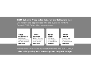
- The no-charge banner features:
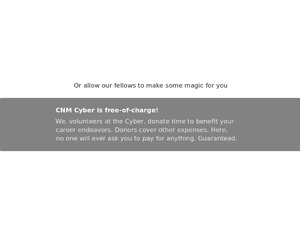
Mobile Tablet Desktop Fireframe draft To be decided Body This section may or may not be included depending on the designer's preference Text on a picture; the picture is the background
Stories
- The stories' screen features:
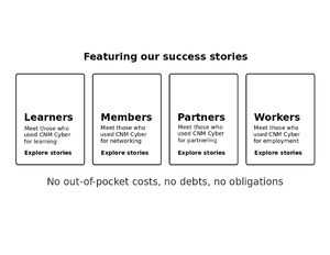
Mobile Tablet Desktop Fireframe draft To be decided Body To be decided; this could be a manual carousel or something else
Tiles
- The tiles' screen features:
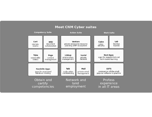
Mobile Tablet Desktop Fireframe draft To be decided Body The customer loves tiles similar to Windows 8 start menu. If you forgot how they looked like, you are welcome to get to around 1:00/12:43 of this video -- https://www.youtube.com/watch?v=_E1UxI5I_jo -- the tiles could flip and slide both vertically and horizontally.
Choices
- The choices' screen features:
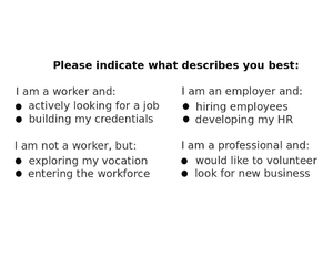
Mobile Tablet Desktop Fireframe draft To be decided Body This section is the most questionable. There can be 8 buttons on the desktop version. However, the most logical thing would be to have four action areas and deeper choices on another page.
Leads
- The leads' screen features:
Mobile Tablet Desktop Fireframe draft To be decided Body Whatever design would be, its action areas shall be similar to the ones on the landing screen.
Bottom
- The bottom screen features:
Mobile Tablet Desktop Fireframe draft To be decided Body The standard footer is fine; the "stay in touch" action area shall include social media icons.
