Difference between revisions of "CNMCyber.com design"
(→Landing) |
(→Landing) |
||
| Line 11: | Line 11: | ||
|[[File:Focnm-org.png|thumb]]||On the right | |[[File:Focnm-org.png|thumb]]||On the right | ||
|- | |- | ||
| − | + | !Header | |
| − | + | | | |
| + | #Logo | ||
| + | #Main menu | ||
| + | | | ||
| + | #Logo | ||
| + | #Search bar | ||
| + | #Main menu | ||
| + | |- | ||
| + | |||
|} | |} | ||
Revision as of 22:17, 19 March 2021

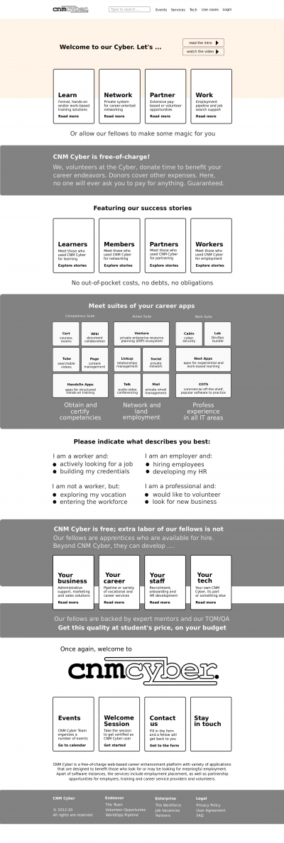
Draft of CNMCyber.com desktop landing. The blocks indicate positioning, but various elements and colors are yet to be designed.
CNMC landing design is the design of the primary landing page of CNMCyber.com.
Landing
- The landing screen features:
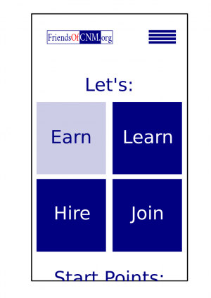
Mobile Desktop Fireframe draft On the right Header - Logo
- Main menu
- Logo
- Search bar
- Main menu
Fonts
- They shall be stylish, but simple. No more than 2 fonts including the logo.
Colors
- They shall be stylish, but simple. No more than 3 colors including the logo, but excluding color pictures. Here is the previous design that the same customer purchased before -- https://worldopp.com/
Sections (screens)
Tiles screen
- We love tiles similar to Windows 8. If you forgot how they looked like, you are welcome to get to around 1:00/12:43 of this video -- https://www.youtube.com/watch?v=_E1UxI5I_jo -- the tiles could flip and slide both vertically and horizontally.
