Difference between revisions of "CNMCyber.com design"
(→Designer-search ad) |
|||
| (107 intermediate revisions by the same user not shown) | |||
| Line 1: | Line 1: | ||
| − | + | [[CNMCyber.com design]] is the design of the primary [[landing page]] (hereinafter, the ''Page'') of [[CNMCyber.com]]. | |
| − | == | + | ==Trivia== |
| − | [[ | + | ===Action areas=== |
| + | :There are three groups of action areas on the ''Page'': | ||
| + | :#[[#Landing|Landing screen]], | ||
| + | :#[[#Stories|Stories screen]], | ||
| + | :#[[#Leads|Leads screen]], | ||
| + | :The sizes of these areas shall be the same. | ||
| − | === | + | ===Colors=== |
| − | : | + | :They shall be stylish, but simple. No more than 3 colors including the logo, but excluding color pictures. Here is the previous design that the same customer purchased before -- https://worldopp.com/ |
| − | |||
| − | |||
| − | |||
| − | |||
| − | |||
| − | |||
| − | |||
| − | |||
| − | |||
| − | |||
| − | |||
===Fonts=== | ===Fonts=== | ||
:They shall be stylish, but simple. No more than 2 fonts including the logo. | :They shall be stylish, but simple. No more than 2 fonts including the logo. | ||
| − | === | + | ===Photos=== |
| − | : | + | :Stock images can be used as placeholders; the permanent images shall be taken from https://www.meetup.com/TechDC/photos/ |
| + | |||
| + | ===Wiferfames=== | ||
| + | :{|class="wikitable" width=100% style="text-align:center;" | ||
| + | | | ||
| + | !Mobile!!Tablet!!Desktop | ||
| + | |- | ||
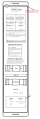
| + | !Draft | ||
| + | |colspan="2"|To be decided||[[File:Cnm-cyber-com.png|thumb]]The blocks indicate positioning, but various elements and colors are yet to be designed. | ||
| + | |} | ||
| + | |||
| + | ==Sections (screens)== | ||
| + | |||
| + | ===Landing=== | ||
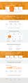
| + | :The landing screen features: | ||
| + | :{|class="wikitable" width=100% style="text-align:center;" | ||
| + | | | ||
| + | !Mobile!!Tablet!!Desktop | ||
| + | |- | ||
| + | !Fireframe draft | ||
| + | |[[File:Focnm-org.png|thumb|Draft for inspiration]]||rowspan="3"|To be decided||[[File:Landing-screen.png|thumb]] | ||
| + | |- | ||
| + | !Header | ||
| + | |Logo, main menu | ||
| + | |Logo, search bar, main menu | ||
| + | |- | ||
| + | !Action area | ||
| + | |No background; (a) invitation "Let's", (b) 4 action areas, (c) upper half of the next section title | ||
| + | |Video background; (a) invitation "Welcome to Cyber. Let's", (b) 2 "more" buttons, (c) 4 action areas, (d) upper half of the border-less banner "Or allow our fellow to make some magic for you" | ||
| + | |} | ||
| + | |||
| + | ===Banner=== | ||
| + | :The no-charge banner features: | ||
| + | :{|class="wikitable" width=100% style="text-align:center;" | ||
| + | | | ||
| + | !Mobile!!Tablet!!Desktop | ||
| + | |- | ||
| + | !Fireframe draft | ||
| + | |colspan="2"|To be decided||[[File:Banner-screen.png|thumb]] | ||
| + | |- | ||
| + | !Body | ||
| + | |colspan="2"|This section may or may not be included depending on the designer's preference||Text on a picture; the picture is the background | ||
| + | |} | ||
| + | |||
| + | ===Stories=== | ||
| + | :The stories' screen features: | ||
| + | :{|class="wikitable" width=100% style="text-align:center;" | ||
| + | | | ||
| + | !Mobile!!Tablet!!Desktop | ||
| + | |- | ||
| + | !Fireframe draft | ||
| + | |[[File:Focnm-slider.png|thumb|Draft for inspiration]]||To be decided||[[File:Stories-screen.png|thumb]] | ||
| + | |- | ||
| + | !Body | ||
| + | |colspan="3"|To be decided; this could be a manual carousel or something else | ||
| + | |} | ||
| + | *https://premiumaddons.com/carousel-widget-for-elementor-page-builder/ | ||
| + | |||
| + | ===Tiles=== | ||
| + | :The tiles' screen features: | ||
| + | :{|class="wikitable" width=100% style="text-align:center;" | ||
| + | | | ||
| + | !Mobile!!Tablet!!Desktop | ||
| + | |- | ||
| + | !Fireframe draft | ||
| + | |colspan="2"|To be decided||[[File:Tiles-screen.png|thumb]] | ||
| + | |- | ||
| + | !Body | ||
| + | |colspan="3"|The customer loves tiles similar to Windows 8 start menu. If you forgot how they looked like, you are welcome to get to around 1:00/12:43 of this video -- https://www.youtube.com/watch?v=_E1UxI5I_jo -- the tiles could flip and slide both vertically and horizontally. | ||
| + | |} | ||
| + | |||
| + | ===Choices=== | ||
| + | :The choices' screen features: | ||
| + | :{|class="wikitable" width=100% style="text-align:center;" | ||
| + | | | ||
| + | !Mobile!!Tablet!!Desktop | ||
| + | |- | ||
| + | !Fireframe draft | ||
| + | |colspan="2"|To be decided||[[File:Choice-screen.png|thumb]] | ||
| + | |- | ||
| + | !Body | ||
| + | |colspan="3"|This section is the most questionable. There can be 8 buttons on the desktop version. However, the most logical thing would be to have four action areas and deeper choices on another page. | ||
| + | |} | ||
| + | |||
| + | ===Leads=== | ||
| + | :The leads' screen features: | ||
| + | :{|class="wikitable" width=100% style="text-align:center;" | ||
| + | | | ||
| + | !Mobile!!Tablet!!Desktop | ||
| + | |- | ||
| + | !Fireframe draft | ||
| + | |colspan="2"|To be decided||[[File:Leads-screen.png|thumb]] | ||
| + | |- | ||
| + | !Body | ||
| + | |colspan="3"|Whatever design would be, its action areas shall be similar to the ones on the [[#Landing|landing screen]]. | ||
| + | |} | ||
| + | |||
| + | ===Bottom=== | ||
| + | :The bottom screen features: | ||
| + | :{|class="wikitable" width=100% style="text-align:center;" | ||
| + | | | ||
| + | !Mobile!!Tablet!!Desktop | ||
| + | |- | ||
| + | !Fireframe draft | ||
| + | |[[File:Focnm-org-footer-start.png|thumb|Draft for inspiration]]||To be decided||[[File:Bottom-screen.png|thumb]] | ||
| + | |- | ||
| + | !Body | ||
| + | |colspan="3"|The standard footer is fine; the "stay in touch" action area shall include social media icons. | ||
| + | |} | ||
| − | === | + | ==Design drafts== |
| − | |||
| − | === | + | ===Early drafts=== |
| − | : | + | <gallery> |
| + | File:Wireframe-mobile.PNG|Early wireframe for the mobile landing | ||
| + | File:Cnmcyber-com-desktop.jpg|Early desktop design draft | ||
| + | </gallery> | ||
| − | === | + | ===Latest drafts=== |
| − | : | + | <gallery> |
| + | File:Cnmc-mobile.jpg|Latest mobile design draft | ||
| + | File:Cnmc-desktop.jpg|Latest desktop design draft | ||
| + | </gallery> | ||
Latest revision as of 01:13, 18 November 2023
CNMCyber.com design is the design of the primary landing page (hereinafter, the Page) of CNMCyber.com.
Contents
Trivia
Action areas
- There are three groups of action areas on the Page:
- The sizes of these areas shall be the same.
Colors
- They shall be stylish, but simple. No more than 3 colors including the logo, but excluding color pictures. Here is the previous design that the same customer purchased before -- https://worldopp.com/
Fonts
- They shall be stylish, but simple. No more than 2 fonts including the logo.
Photos
- Stock images can be used as placeholders; the permanent images shall be taken from https://www.meetup.com/TechDC/photos/
Wiferfames
Mobile Tablet Desktop Draft To be decided The blocks indicate positioning, but various elements and colors are yet to be designed.

Sections (screens)
Landing
- The landing screen features:
Mobile Tablet Desktop Fireframe draft To be decided Header Logo, main menu Logo, search bar, main menu Action area No background; (a) invitation "Let's", (b) 4 action areas, (c) upper half of the next section title Video background; (a) invitation "Welcome to Cyber. Let's", (b) 2 "more" buttons, (c) 4 action areas, (d) upper half of the border-less banner "Or allow our fellow to make some magic for you"


Banner
- The no-charge banner features:
Mobile Tablet Desktop Fireframe draft To be decided Body This section may or may not be included depending on the designer's preference Text on a picture; the picture is the background

Stories
- The stories' screen features:
Mobile Tablet Desktop Fireframe draft To be decided Body To be decided; this could be a manual carousel or something else


Tiles
- The tiles' screen features:
Mobile Tablet Desktop Fireframe draft To be decided Body The customer loves tiles similar to Windows 8 start menu. If you forgot how they looked like, you are welcome to get to around 1:00/12:43 of this video -- https://www.youtube.com/watch?v=_E1UxI5I_jo -- the tiles could flip and slide both vertically and horizontally.

Choices
- The choices' screen features:
Mobile Tablet Desktop Fireframe draft To be decided Body This section is the most questionable. There can be 8 buttons on the desktop version. However, the most logical thing would be to have four action areas and deeper choices on another page.

Leads
- The leads' screen features:
Mobile Tablet Desktop Fireframe draft To be decided Body Whatever design would be, its action areas shall be similar to the ones on the landing screen.

Bottom
- The bottom screen features:
Mobile Tablet Desktop Fireframe draft To be decided Body The standard footer is fine; the "stay in touch" action area shall include social media icons.


Design drafts
Early drafts
Early wireframe for the mobile landing
Early desktop design draft
Latest drafts

Latest mobile design draft
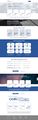
Latest desktop design draft