Difference between revisions of "IDosvid website Banner design"
| Line 33: | Line 33: | ||
*[[Content of the Banner 2 of the "CNM trainings" page]] | *[[Content of the Banner 2 of the "CNM trainings" page]] | ||
*[[Content of the Banner 3 of the "CNM trainings" page]] | *[[Content of the Banner 3 of the "CNM trainings" page]] | ||
| + | |||
| + | [[Category:IDosvid.com Design]] | ||
Latest revision as of 20:42, 5 May 2023
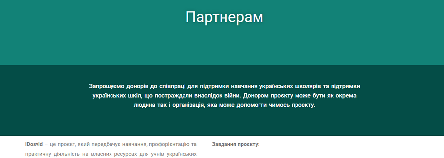
iDosvid website Banner design -- this is design requirements of the Banner of the iDosvid website.
Contents
Colors
- They shall be stylish, but simple. No more than 1 color.
Fonts
- They shall be stylish, but simple. No more than 1 font.
Wifeframes
The Banner screen features:
| Mobile | Tablet | Desktop | |
|---|---|---|---|
| Fireframe draft | To be decided | 
| |
| Body | It should be an attention-grabbing element, bright color or a picture can be the background. | ||
Сontent
The contents of this screen are:
- Content of the iDosvid landing Banner.
- Content of the Banner of the "For student" page
- Content of the Banner of the "Study" page
- Content of the Banner of the "For parents" page
- Content of the Banner of the "For schools" page
- Content of the Banner of the "For partners" page
- Content of the Banner of the "About us" page
- Content of the Banner 2 of the "About us" page
- Content of the Banner of the "Braska School" page
- Content of the Banner of the "CNM trainings" page
- Content of the Banner 2 of the "CNM trainings" page
- Content of the Banner 3 of the "CNM trainings" page