Difference between revisions of "CNMCyber.com"
MariamKhalid (talk | contribs) (→Inspirations) |
(→Inspirations) |
||
| Line 3: | Line 3: | ||
==Inspirations== | ==Inspirations== | ||
| − | + | The customer loves the design of the start screen of Windows 8 and its "tiles". The other websites that may inspire include: | |
| − | + | #https://www.roberthalf.com/ and https://generalassemb.ly/ -- both are similar; they have small pictures on the top, I would make ours movable, and then they add two blocks to separate employers and workers/learners -- great idea and we could do the same -- with our four blocks -- learn, network, partner, work, -- and below the tiles to our services. | |
| − | + | #https://www.hslu.ch/en/ -- another type, more simplistic, but really solid. They target only students; they don't need to separate the visitors, but I decided to add this website since it could be good for worldopp or something like that. | |
| − | #https://www.roberthalf.com/ and https://generalassemb.ly/ -- both are similar; they have small pictures on the top, I would make ours movable, and then they add two blocks to separate employers and workers/learners -- great idea and we could do the same -- | ||
| − | #https://www.hslu.ch/en/ -- another type, more simplistic, but really solid. They target only students; they don't need to separate the visitors, but I decided to add this website | ||
#https://www.learningtree.com/ -- similar to the previous with regard that they don't separate the visitors. Plus, they focus on the search and our search is not good enough for now. | #https://www.learningtree.com/ -- similar to the previous with regard that they don't separate the visitors. Plus, they focus on the search and our search is not good enough for now. | ||
| − | |||
| − | |||
<gallery mode="packed-hover" widths=200px> | <gallery mode="packed-hover" widths=200px> | ||
File:Focnm-org.png|Landing | File:Focnm-org.png|Landing | ||
Revision as of 17:06, 23 June 2020
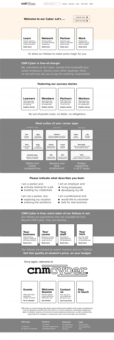
CNMCyber.com is the official website of CNM Cyber.
Contents
Inspirations
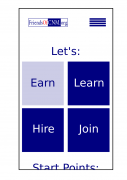
The customer loves the design of the start screen of Windows 8 and its "tiles". The other websites that may inspire include:
- https://www.roberthalf.com/ and https://generalassemb.ly/ -- both are similar; they have small pictures on the top, I would make ours movable, and then they add two blocks to separate employers and workers/learners -- great idea and we could do the same -- with our four blocks -- learn, network, partner, work, -- and below the tiles to our services.
- https://www.hslu.ch/en/ -- another type, more simplistic, but really solid. They target only students; they don't need to separate the visitors, but I decided to add this website since it could be good for worldopp or something like that.
- https://www.learningtree.com/ -- similar to the previous with regard that they don't separate the visitors. Plus, they focus on the search and our search is not good enough for now.
Interface Requirements
Framework and technical
I plan that the landing page must be plain HTML5/CSS/JS , Bootstrap 4. The Page aka future website is built on WordPress. I have purchased the Elementor license.
Structure
- The Website shall have a well designed structure where all of the modules and corresponding activities are logically linked.
- The Website shall be responsive, as to adjust on various devices the users may use. More specifically, interfaces shall be defined for Mobile, Tablet and Desktop screens.
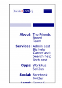
- The Website shall have a Landing page providing links to all of the main pages of the Site. In addition, the Landing page shall be designed for the user to have maximum knowledge of the Website features and content.
- The whole CNM Cyber Welcome Session shall be on the website.
Announcement
We are Looking for an experienced UX/UI designer for responsive Website interfaces. You will be required to work on Photoshop for PSDs or any UI development tools to create website prototypes. Please note that the website is intended to have a simple yet user-friendly structure, so we require attractive, intuitive and functional interfaces for our users. Also, the assignment will initially be on a small scale, for few web pages and if the work is up to the mark, we may extend the contract for long-term. The role may also be working with back-end developers later. We have specifications available for the applicant to review upon request.
Requirements and skills:
- UI, UX interactivity design, preferably on Adobe PSDs . The role will be open to introduce and use any other platform as well.
- Graphic design, a plus but not primarily required
- Website architectural recommendations, a plus.
- Frequent, clear and effective communication.
- Dedication to meet project deadlines in a timely manner.
