Difference between revisions of "IDosvid website Application tiles design"
(Created page with "iDosvid website Tiles design -- this is design requirements of the Tiles of the iDosvid website. ==Colors== :They shall be stylish, but simple. No more th...") |
|||
| Line 13: | Line 13: | ||
|- | |- | ||
! Fireframe draft | ! Fireframe draft | ||
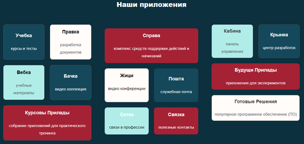
| − | | To be decided, but no more than 4 tiles on one screen || To be decided || [[ | + | | To be decided, but no more than 4 tiles on one screen || To be decided || [[File:Application_tiles.png|border|600px]] |
|- | |- | ||
! Body | ! Body | ||
Revision as of 17:51, 19 March 2023
iDosvid website Tiles design -- this is design requirements of the Tiles of the iDosvid website.
Contents
Colors
- They shall be stylish, but simple. No more than 4 colors.
Fonts
- They shall be stylish, but simple. No more than 2 fonts.
Wifeframes
The Tiles screen features:
| Mobile | Tablet | Desktop | |
|---|---|---|---|
| Fireframe draft | To be decided, but no more than 4 tiles on one screen | To be decided | 
|
| Body | It should be 4 main tiles and click on one of them should appear more tiles | Tiles should be similar to Windows 8 start menu. If you forgot how they looked like, you are welcome to get to around 1:00/12:43 of this video - https://www.youtube.com/watch?v=_E1UxI5I_jo - the tiles could flip and slide both vertically and horizontally. Tiles should include buttons to go to thematic pages. | |
Сontent
The contents of this screen are: