CNMCyber.com design
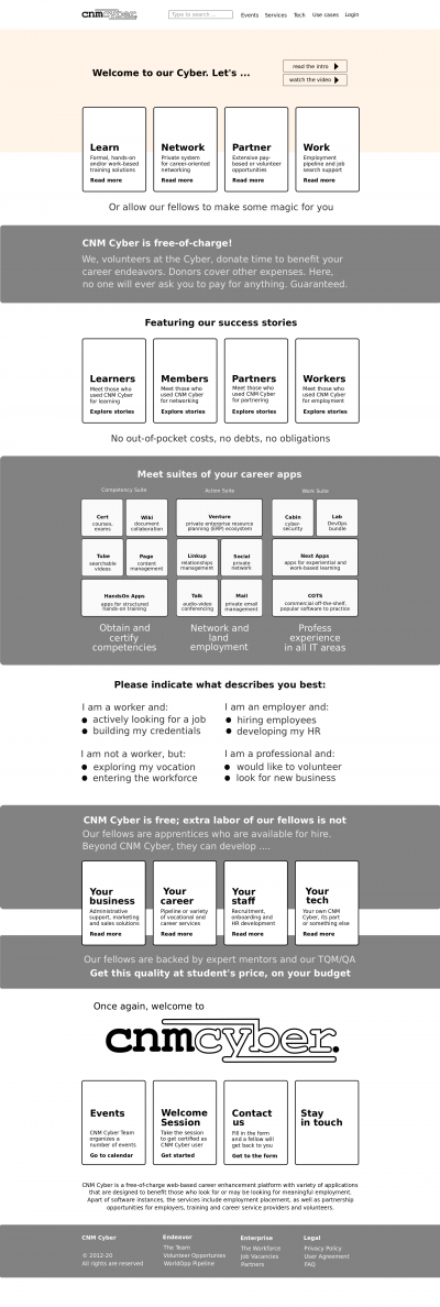
Draft of CNMCyber.com desktop landing. The blocks indicate positioning, but various elements and colors are yet to be designed.
CNMC landing design is the design of the primary landing page of CNMCyber.com.
Contents
Inspirations
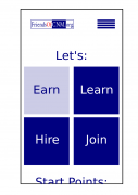
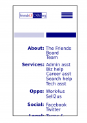
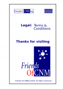
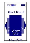
- The drafts that have been developed for FriendsOfCNM.org can also be helpful:
Fonts
- They shall be stylish, but simple. No more than 2 fonts including the logo.
Colors
- They shall be stylish, but simple. No more than 3 colors including the logo, but excluding color pictures. Here is the previous design that the same customer purchased before -- https://worldopp.com/
Logo
- The draft of the logo is developed (its SVG is available per request); however, that can be modified and, especially, its color or colors can be changed.
 CNM Cyber's logo
Pages
Tiles screen
- We love tiles similar to Windows 8. If you forgot how they looked like, you are welcome to get to around 1:00/12:43 of this video -- https://www.youtube.com/watch?v=_E1UxI5I_jo -- the tiles could flip and slide both vertically and horizontally.
