CNMCyber.com design

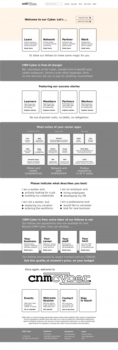
Draft of CNMCyber.com desktop landing. The blocks indicate positioning, but various elements and colors are yet to be designed.
CNMC landing design is the design of the primary landing page of CNMCyber.com.
Contents
Trivia
Fonts
- They shall be stylish, but simple. No more than 2 fonts including the logo.
Colors
- They shall be stylish, but simple. No more than 3 colors including the logo, but excluding color pictures. Here is the previous design that the same customer purchased before -- https://worldopp.com/
Sections (screens)
Landing
- The landing screen features:
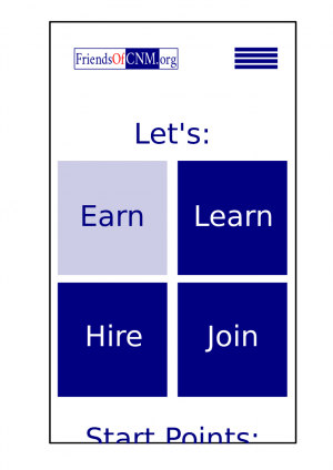
Mobile Desktop Fireframe draft Header - Logo
- Main menu
- Logo
- Search bar
- Main menu
Action area - Invitation "Let's"
- 4 action areas
- Upper half of the next section title
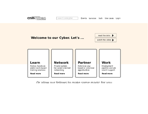
- Invitation "Welcome to Cyber. Let's"
- Video background
- 2 "more" buttons
- 4 action areas
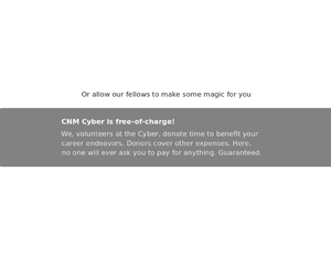
- Borderless banner "Or allow our fellow to make some magic for you"
- Upper half of the next section title
No-charge banner
- The no-charge banner features:
Mobile Desktop Fireframe draft To be decided Body This section may or may not be included depending on the designer's preference Text on a picture; the picture is the background
Stories
- The stories' screen features:
Mobile Desktop Fireframe draft To be decided See on the right Body This could be a manual carousel or something else
Tiles
- The customer loves tiles similar to Windows 8. If you forgot how they looked like, you are welcome to get to around 1:00/12:43 of this video -- https://www.youtube.com/watch?v=_E1UxI5I_jo -- the tiles could flip and slide both vertically and horizontally.


