Difference between revisions of "CNMCyber.com design"
(Created page with "400px|thumb|right|Draft of [[CNMCyber.com desktop landing. The blocks indicate positioning, but various elements and colors are yet to be designed.]...") |
|||
| Line 1: | Line 1: | ||
| − | [[File:Cnm-cyber-com.png|400px|thumb|right|Draft of [[CNMCyber.com]] desktop landing. The blocks indicate positioning, but various elements and colors are yet to be designed.]][[CNMC landing design]] is the design of the primary [[landing page]] of [[ | + | [[File:Cnm-cyber-com.png|400px|thumb|right|Draft of [[CNMCyber.com]] desktop landing. The blocks indicate positioning, but various elements and colors are yet to be designed.]][[CNMC landing design]] is the design of the primary [[landing page]] of [[CNMCyber.com]]. |
Revision as of 18:08, 19 March 2021
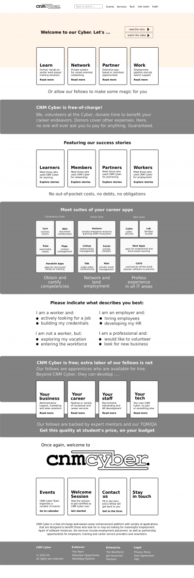
CNMC landing design is the design of the primary landing page of CNMCyber.com.
Contents
Design
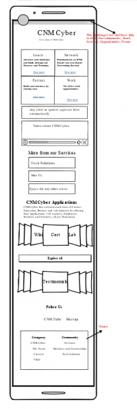
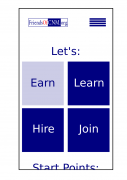
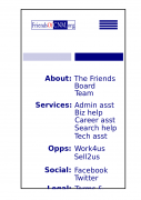
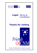
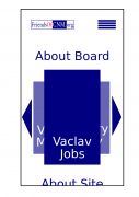
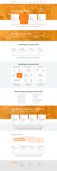
The draft of the desktop and wireframe for the mobile versions are published on the right of this page.
Inspirations
- Anything innovative is welcome, but the customer loves the design of the start screen of Windows 8 and its "tiles" (click here if you forget). The other websites that may inspire include:
- https://www.roberthalf.com/ and https://generalassemb.ly/ -- both are similar; they have small pictures on the top, I would make ours movable, and then they add two blocks to separate employers and workers/learners -- great idea and we could do the same -- with our four blocks -- learn, network, partner, work, -- and below the tiles to our services.
- https://www.hslu.ch/en/ -- another type, more simplistic, but really solid. They target only students; they don't need to separate the visitors, but I decided to add this website since it could be good for WorldOpp or something like that.
- https://www.learningtree.com/ -- similar to the previous with regard that they don't separate the visitors. Plus, they focus on the search and our search is not good enough for now.
- The drafts that have been developed for FriendsOfCNM.org can also be helpful:
Designer-search ad
We are looking for a graphical, UX, and/or UI designer to develop designs for three responsive pages: landing, registration, and post-registration. The assignment is initially on a small scale and further may be extended to long-term collaboration or a permanent position in our growing company. We have secured about 40 domain names; each will host about a dozen websites. Requirements and skills:
- UI/UX interactivity design with Adobe Photoshop or other tools.
- Frequent, clear and effective communication.
- Dedication to meet project deadlines in a timely manner.
To get a contract on any page, you shall be able to communicate how you envision that page be. Please note that any attempt to send any portfolio of works that you claim are yours or express your greatness as a designer will lower, if not disqualify, your candidacy's position.
Fonts
- They shall be stylish, but simple. No more than 2 fonts including the logo.
Colors
- They shall be stylish, but simple. No more than 3 colors including the logo, but excluding color pictures. Here is the previous design that the same customer purchased before -- https://worldopp.com/
Logo
- The draft of the logo is developed (its SVG is available per request); however, that can be modified and, especially, its color or colors can be changed.
 CNM Cyber's logo
Pages
Tiles screen
- We love tiles similar to Windows 8. If you forgot how they looked like, you are welcome to get to around 1:00/12:43 of this video -- https://www.youtube.com/watch?v=_E1UxI5I_jo -- the tiles could flip and slide both vertically and horizontally.
